Syllabus

Artists

Tuesday, September 23, 2014

Stacey Sleight - Assignment #3 - Character Heads


Exploration


Finals


Ginger Dall Assignment 3 - Janitor and Lunch Lady Heads


Head Designs – Ashley Sanborn


Out of Class Assignment #5

Bring a Hard COPY of your Assignment #4 (just the final, not the WIP). also , not just in your sketchbook.  Also bring tracing paper.

you will be doing draw overs of each other's characters to help them strengthen their design.

Assignment #4 - Contrast


Straights and Curves

In this assignment you will Design a circus character (see previous lists), demonstrating your knowledge of straights and curves,  Squash and Stretch and Structure.
ALSO
Consider Story: be able to answer the following questions:
What did my character eat for breakfast
If I met him/her in a dark alley way...

Also part of the assignment:
have a draw-over of your character showing areas of squash and stretch
another draw-over showing your character's structure

These may be done digitally or on tracing paper - post to the blog.

Post all WIP - don't repost old heads or silhouettes.  Be sure to post any new ones.
Due Tuesday at the beginning of class.

Lazy Lines


 Avoid "lazy- Lines."  Each line should be saying something and have a purpose. A lazy Line is a line that does NOT describe anything like shape, texture, softness, hardness, stretch, squish, gravity etc.

If a line or detail is not STRENGTHENING you drawing, then it is just extra baggage and is likely WEAKENING the impact of your drawing.

STREAMLINING - check everything, ask yourself if it is important and what it is doing and if you really need it to convey the personality.  Economize.  Use tracing paper and go over your drawing. leave out frivilous lines and detail.  strengthen the remaining shapes.  balance curves and straights.


Ben Balistreri - Straights and curves

Check out Ben Baistreri's Blog - he does some very nice breakdowns of some of his characters.
Look for his use of Straights vs. Curves!


labels

Interior Silhouettes - Balancing Detail


smart artists make choices....and covering everything evenly with detail is not really making a choice. - mark kennedy

By Making choices where you put you're detail, you are actually controlling where the viewer will look.

CAKE AND FROSTING: Character designs follow a hierarchy: you grab the reader’s attention with the most essential information and then invite them to investigate the details.  If important elements of your design are only evident in the details, then it needs to be reworked.  If your character is not completely distinguishable in silhouette, it needs to be reworked.  Detail should always radiate from the core theme.

There are various ways to do this, in this post, however, I am concentrating on Balancing the Level of Detail:

It's always a challenge to get the viewer's eye to go to the part of a drawing (or painting) that is exactly where we want them to look. And putting detail where you want to attract the eye is a good, foolproof trick. And so, for that to work, the areas where you don't want the audience to look need to be blank, or at least have less detail than the areas where you want them to look.  The opposite of this can also be used. If there is an overload of detail, the eye will be drawn to a place of rest.


It seems that as a general rule, contrast is a key to creating works of art that are interesting to look at, and of course a contrast is created when you have blank spaces against areas of detail, as opposed to a piece of art that is all detail, or a piece that is all blank open areas."

Also remember SMALL, MEDIUM, LARGE and the Gestalt Principle. If everything carries equal weight (in size, value, or detail) Then the brain is unable to organize what it is seeing - Your audience won't know where they are supposed to look or what part of the design is the most important.
This is an example of un organized detail - the result is chaotic


CAKE AND FROSTING: Character designs follow a hierarchy: you grab the reader’s attention with the most essential information and then invite them to investigate the details.  If important elements of your design are only evident in the details, then it needs to be reworked.  If your character is not completely distinguishable in silhouette, it needs to be reworked.  Detail should always radiate from the core theme.  


For more, go to Mark Kennedy's post on DETAIL BALANCE


Straights and Curves/ Squash and Stretch

The Parts of the figure must be put together in a manner that brings out their meaning. Likewise the parts of the figure must be put together in a manner that will portray or caricature the meaning of the pose.
-Walter Stanchfield


When one side of a form stretches, the other side side should squash...and vice versa. This really helps add life to your drawings, get a better feeling of weight and is an aid in avoiding symmetry. A drawing that is totally symmetrical (both sides are mirror images) is usually a flat, uninteresting drawing.  Avoid this and look for how gravity is acting on your design.

Soft mass can stretch out when it's affected by gravity and squash down when it comes into contact with a hard surface.
As people move from place to place and perform actions, their bodies, limbs, even their clothes and hair (and everything else) are affected by the forces exerted by the muscles working against gravity, wind and air resistance, and this is expressed by drawing the forms squashed down or stretched out. Also, bodies can squash or stretch if they're affected by external forces out of their control (like a person tripping and falling face first on the sidewalk...their face might very well squash into the hard pavement). Link


 Use Straights and Curves in areas of natural stretching and squashing to Design your forms and give them rhythm.


No matter how cartoony or realistic you draw, you always design the shapes
go Here - working from big shape design to smaller shape design


I often organize my figures so that one side is always squashing and the other side is stretching - Mark Kennedy


Anthony Holden


 Avoid "lazy- Lines."  Each line should be saying something and have a purpose. A lazy Line is a line that doesn't describe anything like shape, texture, softness, hardness, stretch, squish, gravity etc.


In Nature we see forms in balance, ready to move in any direction. Few fluid forms are completely symmetrical, and the contrast in form and shape makes and active type of balance. One side can be straight while the other bellies out with the relaxed weight, or they can both bend or stretch or twist or turn - it is always possible to make a drawing that is solid, round, pliable and in balance. we call these forms "Plastic" as opposed to "static."
The Illusion of Life


"Usually the part of the body which is Curved is the muscular or fleshy part which bends or folds inward. The straight is usually the Boney part which stretches or pulls tight when bent. Thinking of this will help determine the straights and curves in an object even in a relaxed position."
Milt Kahl


Contrast: Streamline and flow

Contrast - appeal to they eye

The Human Eye is Interested in Contrast:

Value
Detail
Squash and stretch
Straights and curves

Contrast in line is one of the most basic design elements - straight lines against curved lines. A drawing that is all straight lines will be stiff. A drawing that is all curved lines will probably look mushy. A drawing with a good balance of curved and straight lines is usually the best solution.


Straights against Curves: Seven Camels 

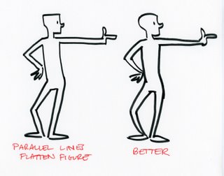
For some reason this is one of those things that can be hard for our brains to comprehend easily. If I'm not careful, I find that in life drawing I tend to draw figures with the exact same curve on both sides of the body and it always looks mushy. I guess our brains have a natural tendency to even things out and make them balanced and static. So try to keep this in mind and train yourself to always avoid parallels in your drawing. Straight parallel lines in your drawing should be avoided as well - again, it tends to be lifeless. Even in the simplest of drawings, removing the parallel lines immediately improves the drawing.

This touches on yet another big secret of design - avoid symmetry. The human eye doesn't like symmetry. It's lifeless and boring. 
Mark Kennedy

d